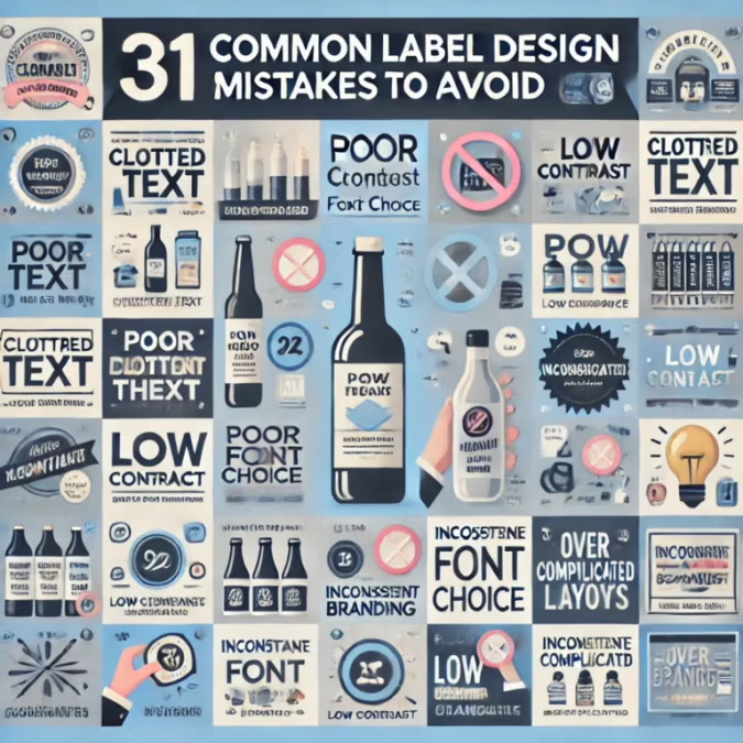
31 how to Avoid These Common Label Design Mistakes
How to Avoid These Common Label Design Mistakes
Creating an effective label involves more than just slapping a logo and some text onto a product. Labels are essential for communicating brand identity, key product details, and even customer engagement. However, many businesses make critical mistakes in label design that can cost them sales and brand loyalty. In this guide, we’ll explore 31 common label design mistakes and how to avoid them to ensure your products capture the attention they deserve.
- Ignoring Readability
- Mistake: Using fonts that are too small, overly decorative, or hard to read.
- Solution: Opt for clean, legible fonts with appropriate spacing and font size to make information easy to read, even from a distance.
- Overloading Information
- Mistake: Cramming too much information onto a label.
- Solution: Prioritize essential information and use concise wording. Utilize visual elements like icons for quick information transfer.
- Poor Color Contrast
- Mistake: Choosing colors that blend into each other, making text and images difficult to see.
- Solution: Use high-contrast color combinations (e.g., dark text on a light background) to improve readability and aesthetics.
- Ignoring Brand Consistency
- Mistake: Using a different design style from the rest of your branding.
- Solution: Maintain consistent use of colors, fonts, and logos to align the label with your overall brand image.
- Low-Quality Images
- Mistake: Using pixelated or low-resolution images that look unprofessional.
- Solution: Use high-resolution images and ensure they are scaled appropriately for the label size.
- Neglecting Label Material
- Mistake: Choosing the wrong material that doesn’t match the product’s use or durability needs.
- Solution: Use materials like durable polycarbonate for outdoor products and polyester for water-resistant items.
- Incorrect Sizing
- Mistake: Labels that are too big or too small for the product.
- Solution: Measure the product accurately and create a label size that complements the packaging.
- Ignoring Legal Requirements
- Mistake: Not including mandatory information like ingredients, warnings, or certifications.
- Solution: Stay informed about industry regulations and ensure that required information is included.
- Skipping Prototyping
- Mistake: Going straight to production without testing the label.
- Solution: Print and test prototypes to check how they look on the actual product and make necessary adjustments.
- Using Generic Design Templates
- Mistake: Using overused, generic design templates that don’t reflect your brand’s uniqueness.
- Solution: Invest in custom design work to make your labels stand out.
- Poor Adhesion Choices
- Mistake: Using labels that don’t stick well to the product or fall off easily.
- Solution: Choose adhesives suitable for the product material and environmental conditions it will face.
- Not Accounting for Environmental Factors
- Mistake: Labels that fade, tear, or peel in specific conditions like sunlight or humidity.
- Solution: Use weatherproof or UV-resistant materials when needed.
- Cluttered Design
- Mistake: Overcrowding the label with too many elements, making it hard to focus.
- Solution: Use white space effectively to create a balanced design.
- Neglecting the Brand Message
- Mistake: Failing to communicate what the brand stands for.
- Solution: Incorporate brand values and tone into the label design to resonate with your target audience.
- Ignoring Texture and Finish Options
- Mistake: Using a standard matte or gloss without considering its impact on the design.
- Solution: Experiment with different finishes like matte, gloss, or textured labels to enhance the product’s appeal.
- Mismatched Fonts
- Mistake: Using too many different fonts that create a chaotic look.
- Solution: Limit the design to two complementary fonts for a clean and cohesive appearance.
- Failing to Highlight Key Information
- Mistake: Important details like product name or benefits don’t stand out.
- Solution: Use size, color, and font weight strategically to draw attention to crucial information.
- Inadequate Border or Bleed
- Mistake: Designing labels without accounting for printing margins, resulting in cut-off elements.
- Solution: Add a sufficient bleed area to the design file to avoid edge cuts during printing.
- Not Considering the Product’s Shape
- Mistake: Designing a flat label that doesn’t wrap well around curved or irregular surfaces.
- Solution: Adapt the design to the shape of the container to ensure it fits and looks attractive.
- Lack of Contrast with the Product Container
- Mistake: A label that blends too much with the container’s color.
- Solution: Choose label colors that contrast with the product container for better visibility.
- Ignoring Customer Preferences
- Mistake: Designing labels that don’t resonate with the target audience.
- Solution: Conduct market research or use focus groups to gain insight into what appeals to your customer base.
- Overuse of Effects
- Mistake: Using too many effects like drop shadows or gradients that clutter the design.
- Solution: Apply effects sparingly and ensure they enhance, not overwhelm, the design.
- Failing to Use Sustainable Practices
- Mistake: Using non-recyclable or environmentally harmful materials.
- Solution: Choose eco-friendly label options to appeal to environmentally conscious consumers.
- Inconsistent Alignment
- Mistake: Text or design elements are misaligned, making the label look unprofessional.
- Solution: Use grid guides and alignment tools in design software for precise placement.
- Unclear Branding
- Mistake: Not making the brand logo or name prominent enough.
- Solution: Place the brand name and logo prominently to boost brand recognition.
- Unoptimized QR Codes or Barcodes
- Mistake: Codes that are too small, not scannable, or placed in an awkward position.
- Solution: Ensure barcodes and QR codes are an adequate size and placed where they are easily scanned.
- Not Including a Call to Action
- Mistake: Missing an opportunity to engage customers through a call to action.
- Solution: Add a phrase like “Try Now” or “Limited Edition” to drive customer interest.
- Designing for Trends Over Timelessness
- Mistake: Creating labels that are trendy now but will quickly become outdated.
- Solution: Choose design elements that have staying power while incorporating subtle trend influences.
- Neglecting International Considerations
- Mistake: Failing to account for language, symbols, or colors that may be interpreted differently in other cultures.
- Solution: Adapt the label for international markets if your product is sold globally.
- Not Proofreading
- Mistake: Typos or errors that can make a brand look careless.
- Solution: Double-check all text and have multiple people proofread the design before printing.
- Skipping Professional Input
- Mistake: Designing labels without consulting with a professional designer or label expert.
- Solution: Even if you’re designing in-house, getting feedback from professionals can offer valuable insight and avoid costly mistakes.
Conclusion: how to Avoid These Common Label Design Mistakes
By avoiding these common mistakes, you can create labels that not only look professional but also enhance your brand image, communicate key product information effectively, and attract more customers to your small business.
Contact Details:
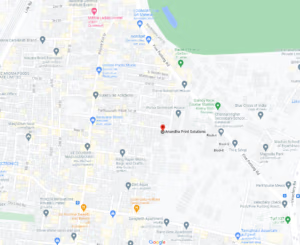
Address:
ANANDHA PRINT SOLUTIONS PVT LTD
32/2, First Floor,
Sathanipet 2nd Street,
Adj. Five Furlong Road,
Maduvinkarai, Guindy,
Chennai, Tamil Nadu,
India- 600 032.
Phone:
+91 98409 64267
Email:
info@aprints.in
sales@aprints.in
admin@aprints.in
accounts@aprints.in
design@aprints.in
Geo – Domestic State Supplies
Andhra Pradesh | Arunachal Pradesh | Assam | Bihar | Chhattisgarh | Goa | Gujarat | Haryana | Himachal Pradesh | Jharkhand | Karnataka | Kerala | Madhya Pradesh | Maharashtra | Manipur | Meghalaya | Mizoram | Nagaland | Odisha | Punjab | Rajasthan | Sikkim | Tamil Nadu | Telangana | Tripura | Uttarakhand | Uttar Pradesh | West Bengal
Geo – Domestic City Supplies
Chennai | Mumbai | Kolkatta | Delhi | Bengaluru | Hyderabad | Coimbatore | Thirchy | Madurai| Salem | Erode | Kanyakumari | Thanjavur | Tirunelveli | Vellore | Tiruppur | Kochi | Thiruvananthapuram | Kozhikode | Thrissur | Kollam | Tumkur | Mangalore | Mysore | Udupi | | Davangere | Dharwad | Hubli | Belgaum | Chitradurga | Karwar | Batkal | Visakhapatnam | Vijayawada | Nellore | Sri City (Tada) | Rajahmundry | Ongole | Tirupathi | Kakinada | Amaravathi | Guntur | Anantapur | Kadappa | Ahmedabad | Surat | Vadodra | Rajkot | Bhavnagar | Jamnagar | Jaipur | Jodhpur | Udaipur | Ajmer
International Supplies
Asia- Malaysia | Singapore | Japan | Korea | Thailand | Myanmar | Indonesia | Vietnam | Cambodia | SAARC- Srilanka | Bangladesh | Nepal | Bhutan | Afghanistan | Africa- Algeria | Ethiopia | Ghana | Nigeria | Uganda | Kenya | Tanzania | Uganda | Zambia | Zimbabwe | Egypt | Middle East- UAE | Kuwait | Qatar | Oman | Kingdom of Saudi Arabia | Bahrain | Jordan | Europe- United Kingdom | Germany | France | Switzerland | Italy | Spain | Portugal | Norway | America– United States Of – America | Canada | Mexico | Brazil | Argentina | Greenland | Other Countries – Russia | Australia


